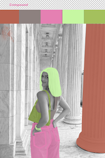
This specific photo of me is one of my favorites, hints why I've used it multiple times in this class already. I began with the last picture and used the greyscale option in Photoshop to get the black and white version of my portrait. I then went on Adobe and picked 3 different scales of color swatches that I thought went well together and best represented my personality. I went with a split complementary, compound, and monochrome scale; I would have to say the monochrome scale came out as my favorite. I then decided what objects I was going to outline to achieve the pop art effect. I knew I wanted to do my hair, purse, top, and jeans because those are the main aspects of the portrait. I didn't want to be quite done yet, so I also decided to do the closest pillar and my bracelet. Once I had outlined all the different objects on separate layers, I went back in and filled everything in different opacities.
I enjoyed working on this project even though it takes focus and a good amount of dedication to get it done. After rewatching the tutorial that was posted on blackboard, I felt pretty confident going into the project. I think Photoshop is very user-friendly and easy to work with as a first-timer.


Comments
Post a Comment