Posts

Final Portfolio

Image
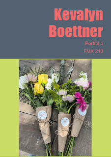
    This is my final portfolio that I made in InDesign. After this assignment, I feel a lot more comfortable working in this specific program. I'm happy that I got to make a portfolio with all of my finished projects so I can show this in interviews for potential internships and jobs.      For this project, I used multiple layers for images, finished projects, Title, Header, Subheaders, and text. These layers made it easy to go back and adjust each specific category. I kept with a floral theme and the colors grey, pink, and bright green. I love the way my whole portfolio turned out and it makes me take a step back and realize all of the work and effort I've put into the course over the semester.   

Business Cards

Image
    These are the three business cards that I worked on for this assignment. This was very tricky for me and did not come easy. I spent hours watching tutorial videos and playing around with trial and error. When I finally got the hang of it, I began using layers. A few that I found myself using more were header, subheader, logo, and background. I really liked how I got to tune my inner creativity and use colors that speak to me. I also played around with different gradients and shades. The last thing that I found that makes my business cards stand out is the symbols I used in front of all of my information on the back.   

InDesign - Beginners

Image
InDesign for Beginners - FREE COURSE https://www.youtube.com/watch?v=RXRT3dHu6_o  I really enjoyed following along with this InDesign video because you didn't need any background knowledge of different programs. The creator went over all of the different techniques you can use when creating a new file. Some of the ones I paid closer attention to were changing the size of the document, the number of pages, and column numbers. He also went on to explain the window tab at the very top. Some different features that appear are layers, links, properties, and so much more. This user was great with explaining what each feature does.   Learn Adobe InDesign in 9 MINUTES! - Formatting, Tools, Layout, Text Etc. - 2020 Beginner Basics https://www.youtube.com/watch?v=0eqhUFRlvgI  When I picked this video I knew I wanted to focus on the specific tools in this new program. I wanted to do this because I've found that if you don't know how to properly use the tools, it's hard to create i

Autoscopy

Image
     Above is my autoscopy project that I worked on over Thanksgiving break. This is by far my favorite end result that I've completed this semester. I really enjoyed getting to take aspects from outer space and correlating them with a picture I took on Halloween in my fembot costume. To gain inspiration I surfed a lot of different websites like Google Images, Pinterest, and a variety of websites that were specifically recommended for this assignment.      I picked four images that I wanted to use; a spacecraft, cluster of aliens, galaxy background, and shooting stars. Going in I knew that I wanted the whole picture to have the same overall theme and ended up choosing space galaxy. The first thing I did when I started editing the original image was the switch from normal to exclusion to give the galaxy vibe.  With each image, I made sure they each had their own layer so I could continue switching from normal to whatever option meshed the best. Once all my images were locked in, I a

Somewhere

Image
       When I found out that we were going to be working in Photoshop I was very excited for this specific reason. I follow people on social media that are famous for editing themselves into famous celebrities' photos and I wanted to know the ins and outs of doing just that. Growing up my favorite movie series was Mean Girls, I would pretend to play the roles of the characters in my everyday life. This project was the closest opportunity for me to be a part of the movie series.      I began with adding the original cover photo from Mean Girls 2 into Photoshop, then started using multiple different layers. Some of the layers I used helped me fix the saturation, hues, and opacities to make myself appear like I was there during the actual photoshoot. As you can tell in my photoshoot picture (last image), the bottom half of my legs is cut off. For this project, I knew I wanted my knees down in the picture because that's how the three characters in the back appear. To do so, I found

Pre-Somewhere

Image
       I personally think that this photo would be the most difficult due to how close they are to each other in the photo. There was no room for error when it came to the edges between them and I think that he did a great job making the photo completely seamless. A few things that would make this specific image difficult to photoshop would be getting the exact skin tones and working very carefully with the feathers.       This photo really inspired me because it brought to my mind that I can also photoshop myself onto a cover. I think this is a really cool concept because I can live my dreams and make them a reality on my own with some simple photoshopping. I don't specifically think that I'll so a magazine cover, but maybe a television show cover instead.       This photoshop project made me laugh because the artist essentially did the opposite of what was asked. Originally he wanted pants photoshopped on just him. Though the outcome was the two gentlemen with pants on ended

Pop Art Photoshop

Image
     This specific photo of me is one of my favorites, hints why I've used it multiple times in this class already. I began with the last picture and used the greyscale option in Photoshop to get the black and white version of my portrait. I then went on Adobe and picked 3 different scales of color swatches that I thought went well together and best represented my personality. I went with a split complementary, compound, and monochrome scale; I would have to say the monochrome scale came out as my favorite. I then decided what objects I was going to outline to achieve the pop art effect. I knew I wanted to do my hair, purse, top, and jeans because those are the main aspects of the portrait. I didn't want to be quite done yet, so I also decided to do the closest pillar and my bracelet. Once I had outlined all the different objects on separate layers, I went back in and filled everything in different opacities.       I enjoyed working on this project even though it takes focus an